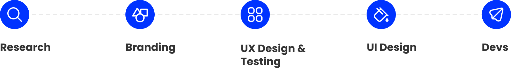
After we did market research,
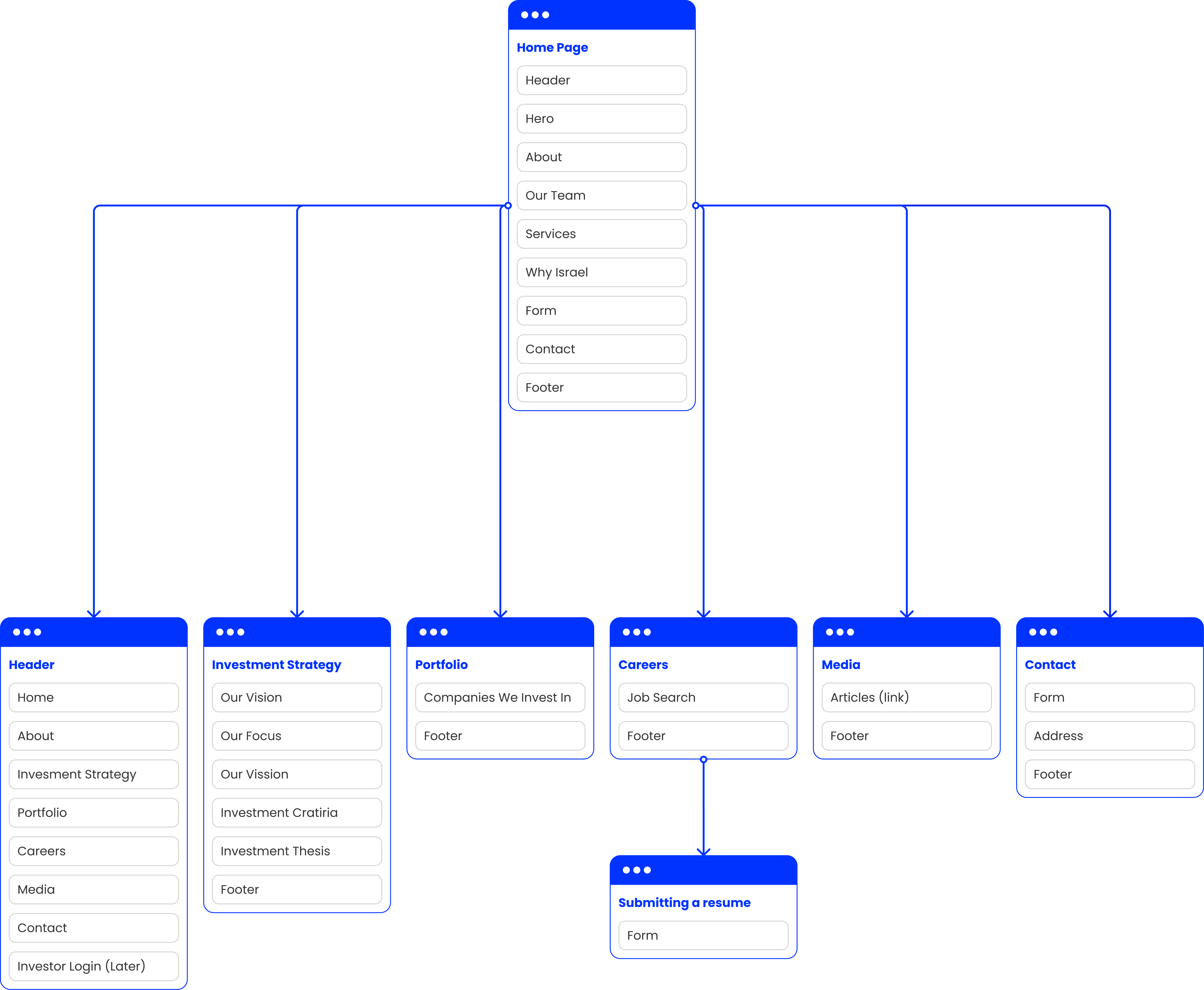
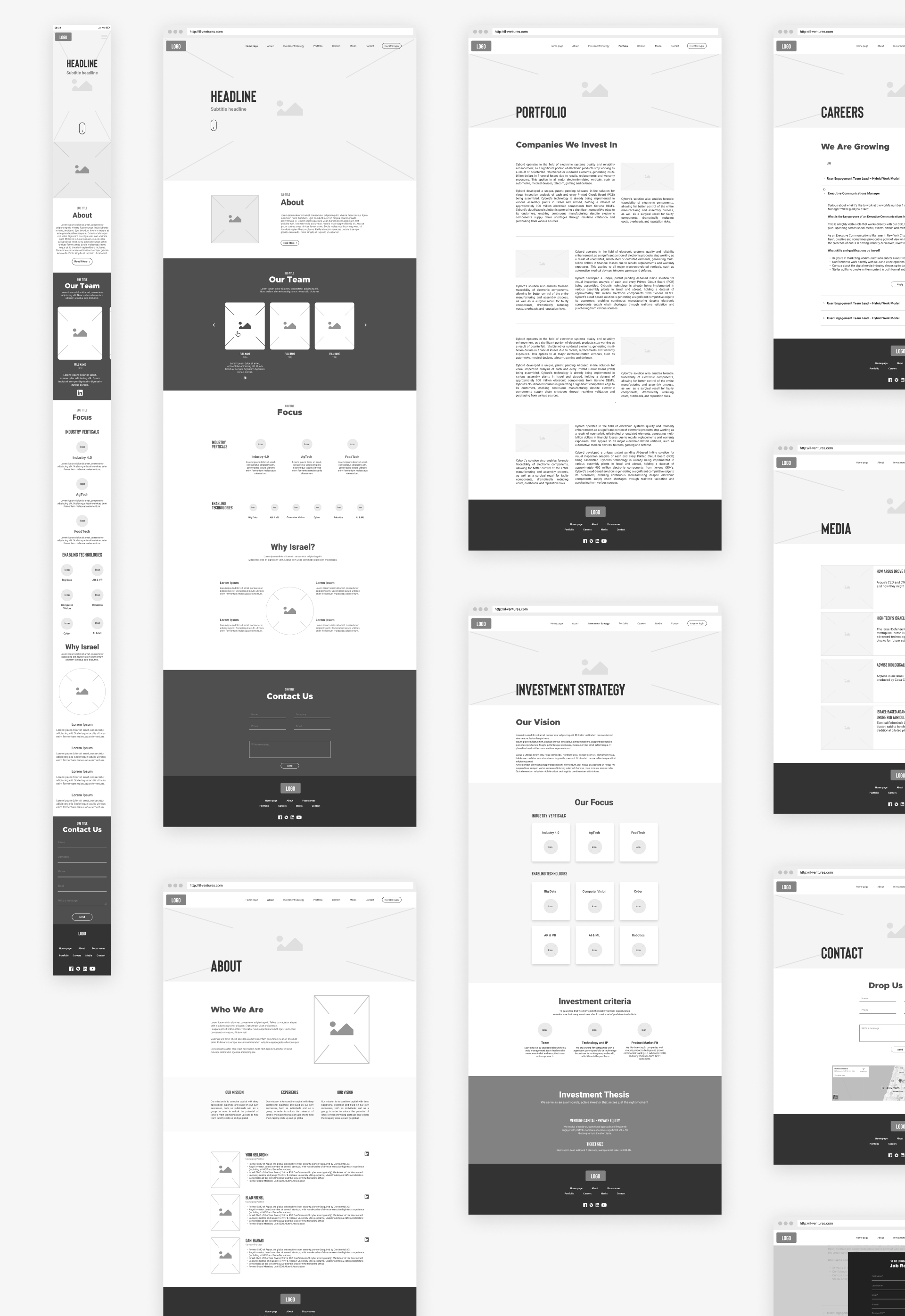
I started characterizing the site, which includes building wireframes.
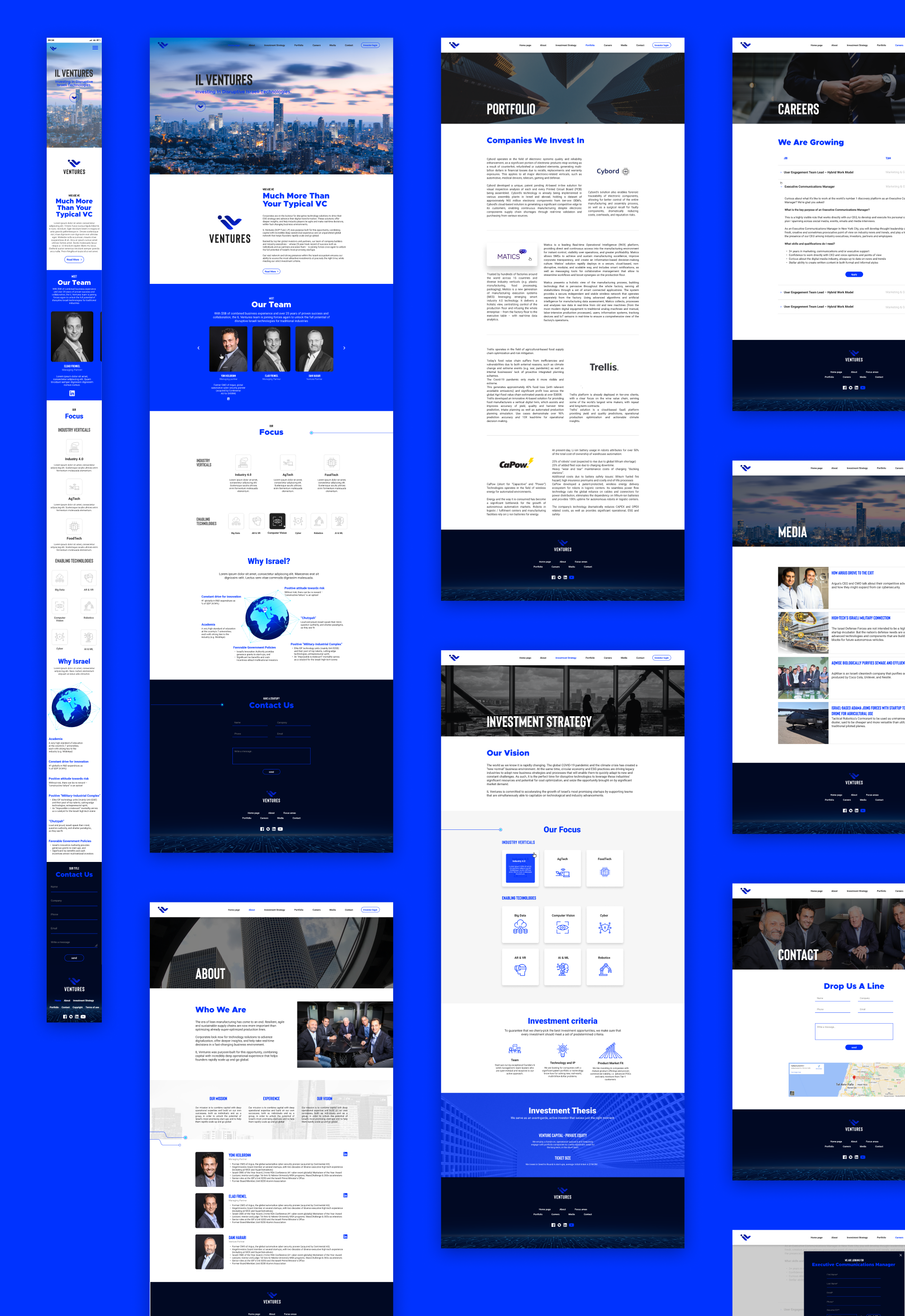
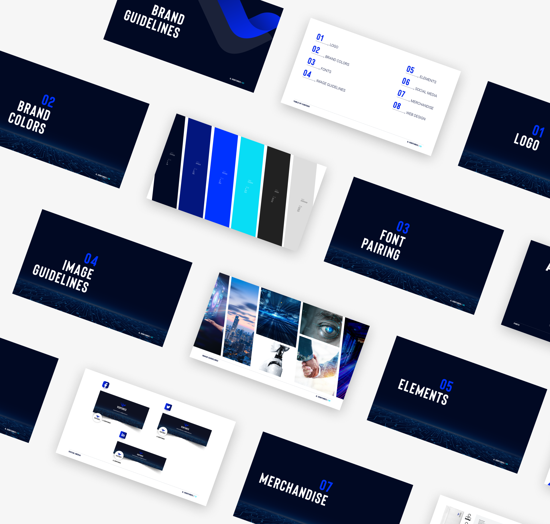
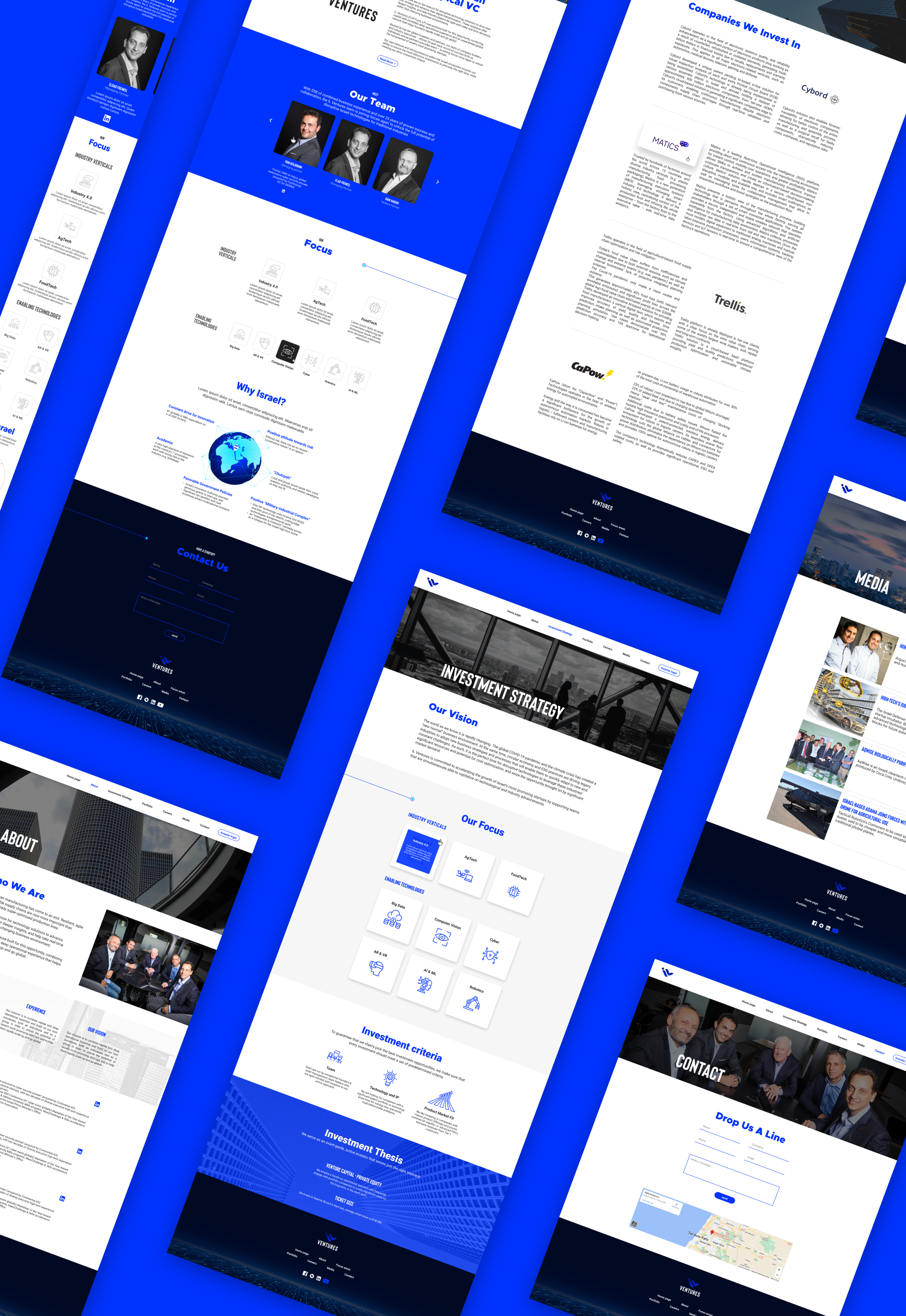
In the branding, I combined shades of blue in order to emphasize the connection to Israel.
In addition, elements representing technology are used in the images as well as in the illustrations.
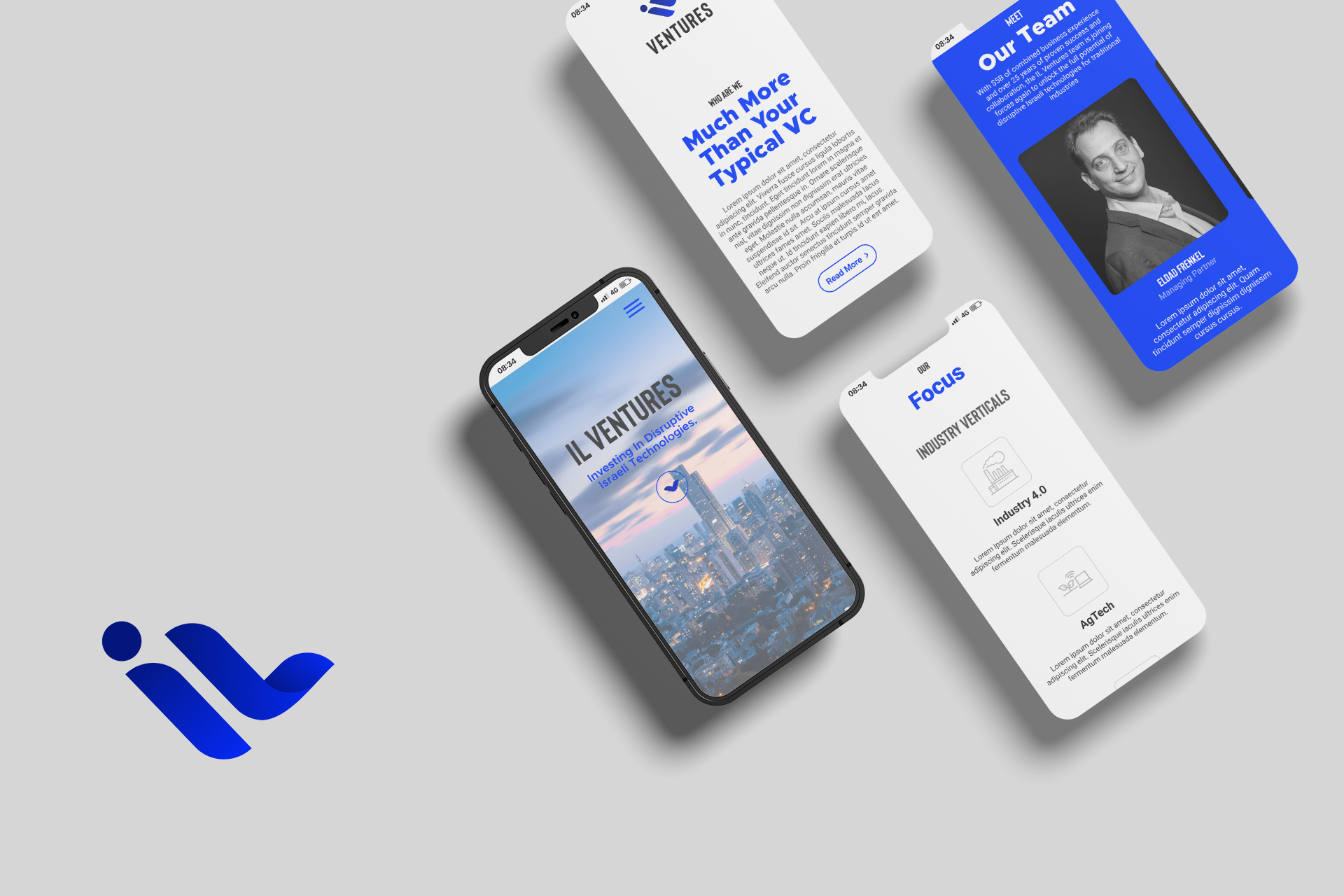
The design is simple and clean,
the rationale was to show luxury.
The dark blues come to emphasize the technological appearance, today, all high-tech software has two display versions, light and dark, most people prefer to use the dark one because it highlights the content.
Implementing the UI materials before sending to development.
If you like what you see and want to work together, get in touch!
noige1993@gmail.com